Monday, 10 February 2014
Friday, 7 February 2014
Analyzing and critically analyzing - Vivienne Westwood
Analyzing and critically analyzing.
Context
1a. What is your professional prospect?
After creating a print for Vivienne Westwood and collecting my research, my professional prospect is to become a print designer for Zandra Rhodes.
1b. What are your personal and professional developments and your future career aspirations?
My personal developments have been towards an interest in Photoshop, I feel that in the past year, my skills have radically improved. This year my professional developments, have been mixing textiles detailed drawings into Photoshop to create prints, I have developed this technique, and this has grown into a career opportunity, I understand that there will be more to learn, and I feel like I want to carry on my talent with Zandra Rhodes, London fashion designer, who specializes in textile print design.
1c. Does your professional and personal development and aspirations meet the current context of the fashion industry?
In my opinion, the fashion industry lacks personal detailed print, just recently in the past 10 years it has been all about animal pattern, and the Scottish pattern, it is not very creative. I believe this is where the fashion industry is heading; the trends are going towards solid and futuristic outfits. I realized that when I stated this project, this was my opportunity to design a print and show it in a more up to date light.
1d. Do you fulfill the industry expectations from graduate to young professional?
I have always had the eye for fashion, knowing what people around me are wearing, how it fits with the recent trends, and knowing what people want and like, from there I can choose what I want to create. Throughout the past year, I have learnt my strongest talent is print design and CAD I look to develop my Photoshop and new software skills. I feel I will get to the stage of high professional standard, I think I will fulfill the industry expectations.
1e. Designer/companies influences- to which market sector do your companies’ choices belong to? Why the companies you have chosen match your professional aspirations and needs?
My market sector company choice is Vivienne Westwood. It is a high-end market sector. It attracts people who are financially stable. I chose her because, I was doing my research for my two chosen companies, I was reading about what her collection for 2014 would be and her main collection was about prints, which were checkered with stars and the Vivienne Westwood logo. I found it quite dull, I decided to follow her collection and see what boundaries she has pushed. Half the collection was print, and the rest was colour block designs. Vivienne Westwood’s collection gave me the inspiration to take elements from her print designs and improve them. I observed that if someone is going to buy a product of a high-end fashion designer, it needs to be of a higher standard.
2. Content/form
2a. What is your e-portfolio about?
I want my e-portfolio to be a series of visuals, to build up the dialogue of what my products are, and to experiment with a lot of Photoshop effects, e.g. adding on filters, blurring things. I think to give a more avant-garde effect, and create white space and collage. It is basically building up information and trying to get the audience to understand what I am doing visually.
2b. What skills did you want to showcase and why?
I think looking back to last year and analyzing the work I did on Photoshop, I was coming into my element of understanding of how print designs were created, I knew my drawing skills were not at a high standard, but scanning the drawing in, and detailed patterns, I have more knowledge and skill to develop on print design. My knowledge for print design is growing radically with the push of watching You Tube videos of adobe workers, such as Terry White and subscribing myself onto his You Tube channel, it allows me to watch over 15o videos of Photoshop techniques, which helps me understand print design. I also got books out the library even though I am not a big reader; I find it easier to research in a book than watching an online video. The reason why I chose this technique to showcase is because I think print design is my strongest skill. It is very interesting that it could be the job role that I could consider in the fashion industry, it will show to the public my progression from education to a profession.
2c. How has the work been arranged? (Composition)
Describing print already done in folder.
2d. Is it harmonious? Is it coherent? Is it pleasing? Does it work well as a whole?
The three products work well together because it’s the repeated print all over the fabric. For the tote bag I mixed another printed fabric that connected with it that was from a previous work, but I think it worked really well and the colours blended. At the end of the project, looking back on the photo-shoot and the products, I do find the work pleasing and eye catching. Overall, the print has been very successful and people will enjoy the mix of colours.
3. Process
3a. How was the work made? What materials, tools and processes did you use?
The materials I used to create the products was printing the print onto heat transfer paper, I used about 40 pieces. I used the heat press to transfer the print onto calico fabric. My intentions were always to use calico, as heat transfer paper is quite stiff so if I used the heat transfer paper on a more light fabric, it would have been ruined.
3b. Have you used a diversity of sources, materials and visuals? How long did it take to make it, did it go as it was planned? Was it executed rapidly or did it evolve over time?
Previously I designed printed t-shirts for a local shop, this gave me the inspiration to show my design on heat transfer paper and to repeat that print over and over again on calico, and start to create the products that I have done. It took me two weeks to afford the ink, to print onto heat transfer paper, and then for me to book the room, to transfer the print onto calico. I started to create the products from then. The only problem was when I heat transferred the print onto the tote bags, as the fabric was pink, the colour didn’t show up correctly, it was more black and white, but it still looked quite effective. My time keeping and preparation to complete the products within two weeks was successful.
4. Final outcome
4a. Does your e-portfolio reflect your strengths, your professional and personal aspirations?
My e-portfolio reflects on my strengths in terms of showing my research and visuals, which I have collected. They have been put together by Photoshop, which has enhanced it. The e-portfolio is for me a way to explore all the work I have created. It is an opportunity to expose my work online, in a professional, creative way.
4b. Does your e-portfolio meet industry’s expectations?
My e-portfolio does meet expectations as it shows my development and progress in my visuals and research of my chosen products. It also shows other job roles, like hair and makeup, photography, and editing the final images with CAD. It shows there is not just one aim to broadcast your work; there are many other skills in the e-portfolio that will interest the fashion industry.
4c. Does your e-portfolio meet the professional standard? How well have you fulfilled the brief? How would you develop your portfolio?
My e-portfolio is at a professional standard, in the way in which my work is laid out from start to finish, there are lots of visuals that leads up to a dialogue of what my products are, and the CAD skills I have used. I have fulfilled as much as my understanding is of the brief. I feel the brief was clearly defined, and my understanding of what I needed to do. My main success was the photo-shoot, my CAD skills enhanced the print to an eye-catching print, and this was my favourite part. My timekeeping was very important; to make sure the research, the products, and photo-shoot were created at a certain time.
4d. How well have you fulfilled your brief?
The only way I could develop my e-portfolio further, would be to improve my knowledge in CAD, which would allow me to create better layouts and the editing processes.


Editing chosen images for the final selection
A


B


C


D


E

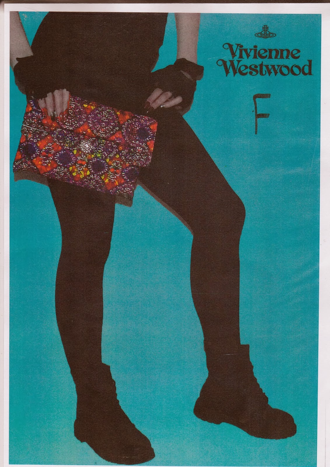
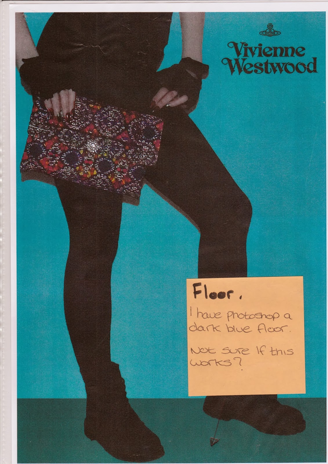
F


My products were very complicated to make. I kept thinking of the best designs that would react better showing my print. My plan was to create a top, a skirt, a tote bag, and tie. My mind had changed about the top and skirt. I am not going to be selling the top or shirt, and I am not having them as a choice. I had to try and find a new design for my choice of products, which I accidently created, one of which was a purse from the back pattern piece of the skirt. This lead to a really good design that people would definitely buy as all women like a stylish purse. I am not worrying that it will not sell, as it is such a stylish product. To finish off that product, the purse, I sewn on a diamond button for it to fasten. The tote bag was nightmare to make. I was going to take the advice from a You Tube video, of how to make a tote bag, but I ended up running out of calico fabric because of the top and skirt. I bought two tote bags in Liverpool, the week before the shoot and cut them up, because the bags were pink, I didn’t realise that when I would transfer the print onto the pink fabric, it wouldn’t show that much colour, more black and white, with blue in the middle, a more of a darker colour. I think it when really well, it looks creative. I had to bag out the bag so I think I make things difficult for myself, without planning which I need to work on. I bag each side of the bag and then put them together to sew down the side seams but doing that resulted in the seams being really thick, so it was really difficult for me to over lock the raw edges. In result, all the products, even the top and the skirt, look really well created. I have no doubt that they will all sell at the end of the year.
On Friday 24th January 2014 at 11am, I came to the location of the shoot at my college studio. I set up my camera, because I have never gone that studio before to check my camera linked up with the light, I was very concerned that it wouldn’t because I think if there was no light it would have been a disaster. It took me an hour of how to do things, and find the settings to ensure the lights did work with the flash, it was successful. The only ordeal that I had was the model came half an hour late, which meant I could not meet her in town, as I had to stay in the studio with the camera. So I had to direct her from Liverpool Central train station to the actual room, so it was complicated to remember where it was. I felt it was unprofessional that I couldn’t meet her, but I couldn’t leave the room. When she arrived at the studio, she was very professional and calm, everything that I talked to her about, and would hope for her to do, her reply was sure that’s fine, she didn’t say no.
At the very beginning of the shoot I did her makeup, I gave her a bold lines on her eyes and lips. I think the makeup showed a different atmosphere than I was going for. To me when I look at the images, I do see a printed top and skirt, which can be photo shoped and enhanced. When you look at the hair and makeup you see a mood change, it’s on the category of drag queen/circus, which didn’t pull off very well. I didn’t realise throughout the shoot, how difficult it would be to Photoshop the background of the image, when she had backcombed hair, as I wanted to enhance the background colour to blue, there was so many areas between the hairs that you would have to do. So as the photo shoot progressed I got her to go onto other products, which I do think went well, but the hair and makeup ruins it a bit. After all the products were done it was a wrap. She went to take the makeup off, and she put her makeup nicely back on. I was looking how she put her makeup on, she had a plain face with foundation on, and dark lips. I asked her if we could take a couple more shoots with that makeup on, but I had the idea to take the skirt and put it on her head, to give it a more elegant feel. I took about another 40+ images of her just simply sat on stool, and holding up the products, but with an elegant pose. I think toward of the end of shoot, I realised the last 40 images, were going to be my final choices for the contact sheets. I understand that towards the end of the photo shoot, the way she positioned herself, and the way she give that impression of these are just the products with the pose, made it more professional and fresh. I was trying to be ambitious with the early point of the shoot, with the makeup and hair, and what position she was, stood up. I should have had that idea all the way through the photo shoot, of it being simple, classy, and focusing more on the print than how her hair was looking.
Overall, I think the shoot went very well. I feel like I did reach my goal, what I set out to do, to just show the print, and that was it. I think it made it look Avant Garde, because I asked her to stick the skirt on her head, which looked like a hat, which was then again showing the print in a different format, it’s not wearable, but it gives you the allusion of what it’s trying to say.
Weaknesses
As I said before the only things that let the photo shoot down were hair and makeup, because of my focus to show the print, the hair and makeup were the last thing on my mind, I didn’t focus on it as much as I did when making the products.


Subscribe to:
Posts (Atom)