


Modelling Products


Top
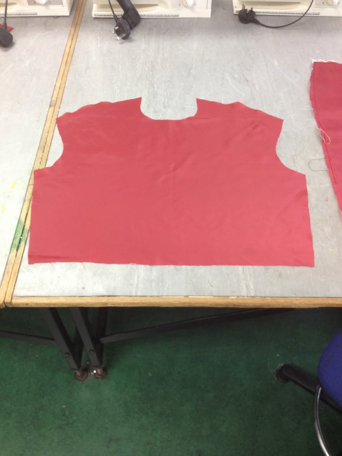
In the beginning of creating the top I knew it would probably be very difficult to heat transfer the print onto the front to try and hide the lines, and to keep it symmetrical as much as I can. My design for the top is a basic sleeveless cut to fold front. After sewing the shoulders and the side seems together, I aligned the top with red lining. Overall for the top, it has worked quite well. The main point about this design is how to improve an original print from Vivienne Westwood. On a positive note the aim has been successful.
Skirt
The skirt was traced around a basic block skirt size 12. It has one seam at the back, and a zip at the side. The skirt was probably the most important part of this project, because it shows great detail of the print. I always knew at the start that I wanted an elasticated waist band. This has always been an idea of mine at the start, as if I am going to have the skirt and the top separate, I would want to give the waist line a bit more of a dynamic effect. Overall, I think it has gone quite well. There are certain areas of the skirt, I find you can really tell that the print is not digital, but even though it’s one of the garments to show the print and only the print, I think this has been quite successful as well.
Purse
The purse was an accidental creation. I was from the cut to pair back block of the skirt. I accidentally made it into a purse to see what it would look like. The best thing about this bag is the print is the print has been laid out perfectly, it all lines up perfectly. As with the rest of the designs and what I have done, I have lined them with red lining fabric. I have hand stitched orange and white pearls in certain areas of the purse to finalise the effect of Vivienne Westwood. I have attached a diamond button as usually you would have the Vivienne Westwood logo, just to give it that Vivienne Westwood look, relating to the iconic royal image for her designs.
Tote bag
The tote bag is a plain, simple bag which the print in full view, a square bag of the print. My intentions are to create a thick bag strap, so it can be used for normal day purposes. This is a nice design to show a simple yet effective design to promote my final print of Vivienne Westwood. Obviously with the rest of the designs, I have put a red lining inside to finish off the design.
Tie
My idea for the tie was to include menswear in my products because I wanted to have a bit of a mix, and also not just for women to enjoy the print and the products I make. The tie is unisex and can be worn by anyone. Pus, the print works really well. The lining for the tie I purposely used a past print, I have used before, and creating a mock-up of the tie, to see if the two prints combined worked, was very important. It worked out very successful. It also gave the effect of two ties into one. You could wear it on any side.
Overall, working with five products I think for me to express more through the print than the manufacturing was a challenge to make the heat transfer look decent on a garment and not look tacky. I believe that my manufacturing skills are not great but they are a reasonable standard, but my CAD skills have developed dramatically whilst creating this print. I don’t think I would use the heat transfer printing again, only reason is, I think it is very difficult to line up such a complex print and trying to make sure that it is presented in a professional way. Also financially I have used the maximum of 40 sheets of heat transfer paper. I think all products went really well. You have just got to keep in mind it’s all about presenting a more advanced, creative print linking with Vivienne Westwood’s latest prints.
The print was created by two layers. I used a technique called Zendoodle when you draw quite a small box, and draw a textured detailed drawing, and colour it in, not too much, showing some white. I would scan the box drawing, and copy onto Photoshop and play around with it, form it into a much bigger textured drawing. My intention was always to have two layers, one layer were all the colour would be and the texture, the other layer would be the two stars.
In certain areas of the background layer I changed the colours relating to the issue that I wanted to show how I can improve print for Vivienne Westwood by taking her colour scheme in certain areas of her collection, and transferring that into a print. In one of the garments that Vivienne Westwood has in her collection at the moment, is a printed dress with the iconic Scottish checked print. There is also a star that keeps repeating throughout the print, that’s where I got the idea to introduce the star into my print.
- I used Vibrence
- I selected certain areas of the background print and used the hue effect to change the colour of the print, a bit more warm, and I get the feel from this print that it’s quite retro.
- I then used quite a lot of exposure/ gamma correction (0.75).
- The filter that I have used on this print was forming a texture of oil paint. I used the filter of oil paint to enhance the bristle detail, to give that smudged look effect.
- I created the stars into enhance colour, that stuck out a bit more.
- I combined both the layers together, and used the sharpened filter to finish off the print.
No comments:
Post a Comment